Media Language and Representation: Lucozade & Shelter
Lucozade
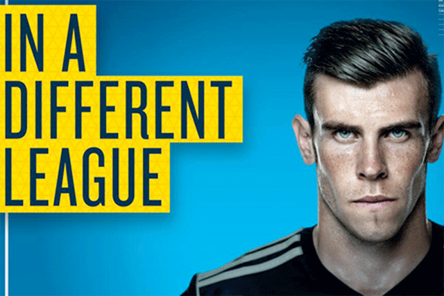
They have used blue as a background as it is a masculine color which is normally associated with men. They have a gradient which goes from blue to a light blue. The light blue has a halo effect around the guy in the picture which points him out to the audience. The gradient around him makes him seem like he is radiant and admitting light and also makes him seem like he has a halo around him which conveys to the audience of his importance.
The yellow color stands out from the blue background especially because it doesn't have the gradient and is a bold color also is the color of the sun and the sun gives people energy which works for a lucozade advert because lucozade is an energy drink. Blue and yellow are the colors of lucozade which subliminally sends the message to the audience that it is a lucozade advert without explicitly saying it. The blue also represent hydration which conveys to the audience that lucozade is hydrating also because Gareth Bale does football as a profession it is a demanding sport which means he needs to be well hydrated, this persuades the audience to think that Gareth drinks lucozade during his football games which will intern persuade them to buy the drink. The grey/black font is there to make the poster more masculine and not colorful the tone of it also matches the tones that they have used in the guy which makes the audiences eyes directly go from the advert as the audiences thinks its conveying the same message. The font of the grey font is in capital letters which makes the message stand out and seem important, also the tall fills the poster and enlarges and elongates the message.
This works well as after the audience reads the message they look at the guy, the message has a double meaning as Gareth Bale is a footballer and he is in an football league, also it conveys to the audience that he is in a higher league than them in the ways of attractiveness and also lifestyle wise as he is a millionaire and lives a luxurious lifestyle and is famous. and that if they drink the drink they will be closer to being like him. The advert works on the basis of Gareth Bale already being an idol for people and to elevate that status even more so they can use him to help sell their products because if audiences buy the product they will think that they are closer to being like him.
Gareth Bale is in his football outfit and looks like he is in the midst of playing it as he is sweaty and looks like he has dirt on his face, also he is frowning and looks like he is deeply concentrating on something his facial expression conveys that he is determined and angry, this conveys that in the middle of a football game he drinks lucozade and he plays better. The emotion which he is conveying which is determined is a highly looked upon quality, also they use this because it shows how he is determined and concentrated in every game which is why he has reached his goal and became successful which makes the audience think that if they drink lucozade they will become more concentrated and focused and will be able to reach their goal and make them think that they can be as successful and have goals as big as Gareth Bale and reach them and become more successful. This may come into their minds without them knowing it because as he is a footballer which will make them subconsciously think of their goals. which is a placebo effect. The photographer has chosen a slightly upper angle to shoot him so he can look at the camera upwards. They have Photoshoped him to be more attractive as he looks different in the picture than in real life, so he can be more attractive to sell more product and so more people look at the poster.
The audiences which will be receiving these messages are football fans which would idolize Gareth Bale so his face being on the advert will persuade audiences to buy the drink. Where these adverts would be placed would be posters which are put up specifically when their are football matches that the team Gareth Bale is on is playing.
The audiences which will be receiving these messages are football fans which would idolize Gareth Bale so his face being on the advert will persuade audiences to buy the drink. Where these adverts would be placed would be posters which are put up specifically when their are football matches that the team Gareth Bale is on is playing.
Shelter

They do not use famous people in their images but use ordinary looking people. All of the people have the same facial expression to emphasize how homeless people do hot have an identity. Also it makes the posters easily recognizable and works to show that they are advertising the same thing. The people in it look passive and as if they have no hope, looking at the people makes the audience sympathize for them. There face has a light which lights them in the middle of their face, this is an unattractive and not attractive light, this light is an uncomfortable exposing light. The light exposes their dark under eye circles and dull skin which which reflects how actual homeless people look, as they look tired and have badly cared for skin as they do not have the means to. The mans beard in the middle is overgrown, they do this to show how he doesn't have money to buy a raiser which represents homeless men. Their eyes stare directly into the camera lens so when they put the picture on the advert the audience is making eye contact with the audience. This combined with the message put on top of the photos gives the effect of the people in the advert saying the message to the audience as when u take u make eye contact. As the message is sad its like they are asking a rhetorical question to the audience, as it is rhetorical the audience cant answer the question, this leads to the audience realizing that they can help the homeless by giving money to the charity. The advert reaches a wider audience than to the people that they want them to contribute money to their charity, it also is advertising their services for anyone which is going through the same issues as the people in their messages. Their passive faces convey
Underneath it is the name of the charity and how to donate money. To communicate how the charity can help they give a statement which acts as a semi response to the rhetorical question. In the one to the left in the message at the bottom they have put that losing your job shouldn't mean that they have to lose their home which is a statement that the audience will agree with after the statement it says 'we can help' which conforms the readers response that donating to the charity can help the homeless. The charities name and website is also in red but is a different font to the message because the logo of the charity is in that font, the charity is a well known one and the repetition of the logo helps it became popular through it being recognizable. The charities website is in red but is in bold so it draws the audiences attention.The black background reflects the pit that they are in because of their problems and the re emphasizes the alert in their message and the white conveys how the shelter can help them.
They have used red see through font which has connotations of murder, blood is the color of caution tape which is used to tape of places which their have been crimes such as murders, this could link into homeless people as they are easy targets for murder also it may convey that being homeless is an injustice to society and it is a crime to no not help them as it will contribute to inequality and poverty. The text is in capital letters, this conveys that it is an important message and combined with the red color it arises the emotion of alert within the audience.
The message is short and and easy to read. The message in the first poster is a rhetorical question, this makes the homeless seem helpless as even the audience cant answer the question. This question creates an impact on the audience as to have a place to live is one of the key things which separates people from poverty, and is a big part of peoples lives as it gives them shelter.
The message in the middle of the poster the message is 'He cant do that' which paints the homeless as victims as the person is out of control of the situation. The statement is ambiguous so he could be helpless in many situations. The charity shelter has given a response to the message underneath it an they talked about how being tenant can be difficult and also shows how they can send support, this implies that the people that ask for help to the shelter are people which live in difficult situations and do not own their own home and rent which shows how their living conditions are bad.
The last advert says 'I cant face it' which is again an ambiguous statement which doesn't specify what she cant face, as the picture like all the rest of the pictures feature people looking sad, traumatized and depressed the audience thoughts immediately go to the worse scenarios. The charity gives a response underneath it with a white font which stands out from the black background, white has connotations of being like a light at the end of the tunnel which contrast the red and black, black has connotations of darkness and bad times. This emphasizes how shelter can have a large positive impact on people with tricky living conditions and are on the verge of being homeless.


Comments
Post a Comment